
The year has got off to a tumultuous start – for many 2020 is looking radically different than we had hoped or expected. But this year also marks a significant milestone for our company: 25 years have passed since Jesper Sandberg started what went on to become Sandberg Translation Partners (STP) in his spare bedroom. Cause to celebrate! ?
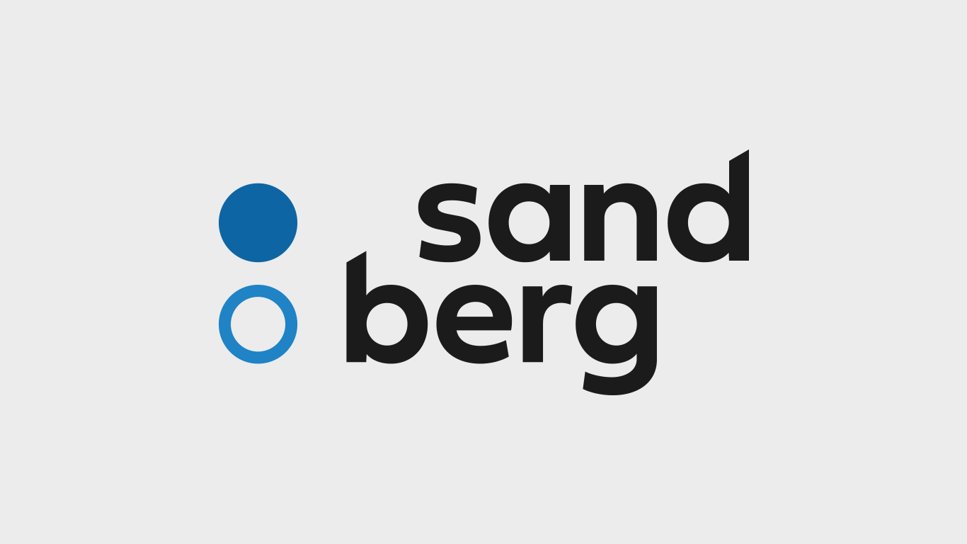
Our celebration plans are being updated in view of recent global events, but one way in which we plan to mark this significant milestone is ready to see the light of day: our new brand. For decades we’ve been known as STP, but from now on, you can call us Sandberg. We’ve designed a bright new logo to go with our new name, and you can read the story behind it below.
Honouring our heritage, projecting our future aspirations
The language services market is evolving at a rapid pace, with consolidations, acquisitions and ever-closer integration and collaboration between language service providers (LSPs and content creators). We’re evolving our services to offer even more value to our clients beyond translation. To reflect this, we felt it was right to update our name to one that is flexible and distinctive.
Our Nordic roots are important to us. Our founder is a Dane and even today many members of our management and production staff are Nordic. This has been essential to the formation of our company culture, where we value directness, openness and honesty. Sandberg is a classic Scandinavian surname, translating roughly as “sand mountain” (many Scandinavian surnames have geographical references).
The name has a number of key advantages:
- It’s distinctive and stands out in the LSP market ✅
- It’s clear and easy to pronounce in many languages ✅
- It adapts as our service offering evolves ✅
We also loved it because it avoids some of the familiar naming tropes in our industry (such as trans- and lingua-) and (perhaps most importantly) it’s not an acronym!
A modern responsive logo
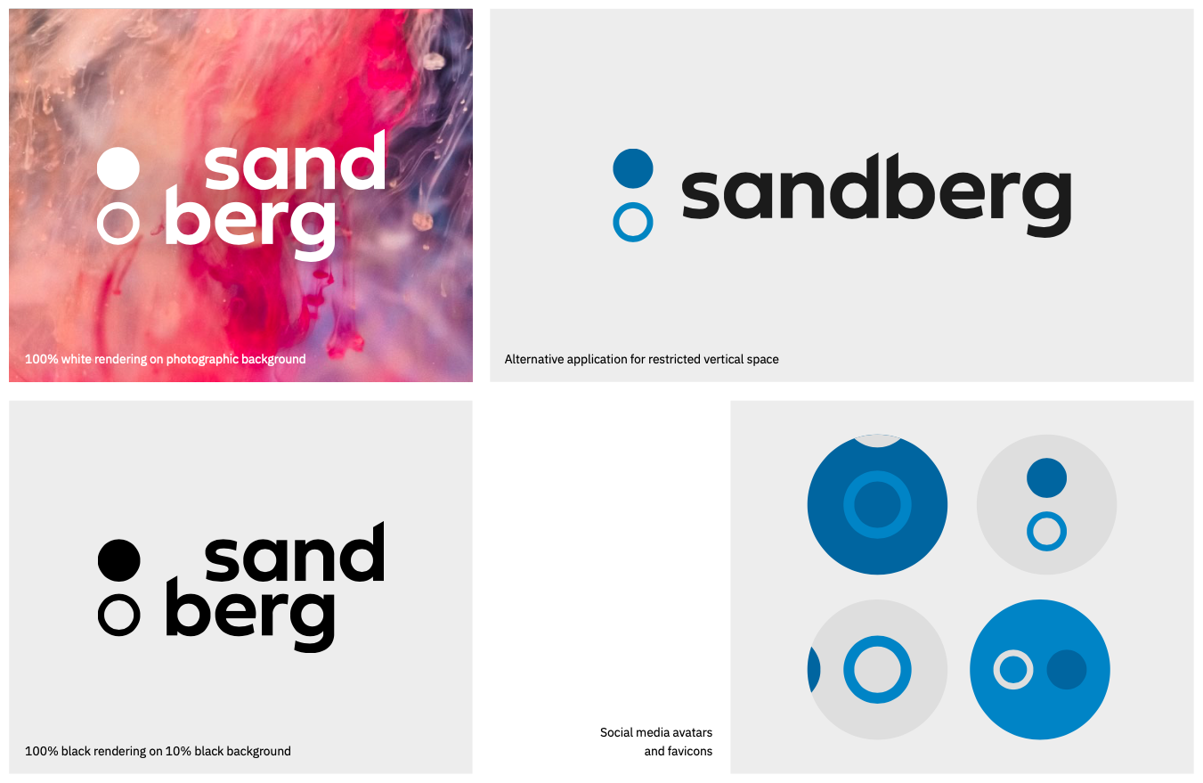
Our new logo incorporates our new name whilst maintaining our familiar trademark blue. This darker shade is accompanied by a brighter shade of blue that pops in digital applications such as social media and our website. Blue represents a common element that ties all the Nordic nations together: the sea. ?
The two dots are imbued with subtle imagery. The hollow dot references the letter å used in Danish, Norwegian and Swedish, and is a nod to our Nordic heritage and core translation offering. Together the dots can also be taken to represent a diaeresis (commonly known as an umlaut), which appears in various languages in the letters ä, ö and ü.
The dot device is offset by a friendly lowercase wordmark. We chose to split our name in two and stack the parts on top of each other next to the dots to create a counterbalance. The ascenders of the ‘d’ and ‘b’ have been cut at the same angle to add energy and interest.
As with almost any identity these days, ours will primarily be encountered in a digital context, which was a guiding light during the design process. This can create constraints in terms of available width and height, hence the need for the logo to be ‘responsive’. With this in mind, we’ve created a version for use in contexts with little vertical space, as well as one without the wordmark for use as our social media avatar and favicon. It also exists in a number of colour applications, offering much greater flexibility than our previous logo.
The entire design process was handled in-house by our Communications department as part of a broader update to our branding that has been gradually rolling out over the past year.
A statement of intent
Musing on the new identity, Sandberg’s Managing Director, Anu Carnegie-Brown says: “For our clients, this means a more recognisable, distinctive presence in a crowded marketplace. It is also a sign of our ambition to expand our service portfolio to our LSP clients by offering them much more than just translation.”
On a practical note, our website and email domains will remain stptrans.com for the time being. The new brand does not affect our legal name, Sandberg Translation Partners Ltd., meaning invoicing and payment arrangements will not change either. You might continue to see STP on some communications in the near future as we complete the process of updating all our materials.
“We’ve got some exciting plans in store for 2020 to mark the milestone of our 25th anniversary. Our new identity represents the first stage of those plans and sets the tone for the way we’ll communicate with our client and supplier partners from now on,” Anu concludes.
For enquiries relating to Sandberg’s new identity, please contact Max Naylor, our Content and Communications Officer, via communications@stptrans.com.