

There’s no doubt that you want users not only to click on your app or visit your website, but also to stay for a while and respond to the products or services on offer. If this is the case, you need to have a UX that works for the user – and that means one that works differently for different people in different places. Read on to find out how you can build on the best practices in UX localisation to thrive on cultural differences and drive business your way.
The key UX localisation challenge
Since the first 500 apps for smartphones were released by Apple’s App Store in 2008, the market for apps has exploded, with 8.9 million apps globally by 2020 and 40% of spending in the Chinese market. Another two million apps were launched in 2021 alone.
E-commerce has generally grown over the same time period: there are now more than five billion internet users world-wide, with e-commerce generating an estimated USD 5.7 trillion of revenue in 2022. Consumers spent 3.8 trillion hours on mobile devices and USD 320,000 every minute through apps in 2021, an increase of 20% on 2020.
Plan for UX success
In the wake of this, a new discipline has emerged: User Experience (UX) design, which embraces not only the functionalities of an app or website, but how the user interacts with these and how well they succeed in making the user want to stay online and use the product or service that you are trying to sell them.
What is UX localisation?
A simple working definition of UX localisation is the adaptation of the user experience to local expectations in terms of language, culture, norms and formats, as well as offering products suited to the local audience.
Using best practices in UX localisation can increase your conversion rates fourfold while making users more engaged, satisfied and therefore more likely to return – this matters because 9 out of 10 users are less likely to return to a website, app or other software-based interface after a bad user experience.
UX design
Localised UX works best when adaptation has been at the forefront of the UX design process. It’s easy to get caught up in the excitement of the user interface and all the wonderful functionalities for users of an app or website but forget that unless the page or app loads in three seconds, more than half of visitors will not stay to enjoy the party. What’s more, the remaining half are 62% less likely to come back and interact again if they have had a negative brand experience on your app or site.
A functioning UX – and therefore a well-localised UX – is absolutely key to winning in the marketplace and ensuring that the return on your UX investment is as high as it can be.
Indeed, the value of UX design became apparent to the entire world in November last year, when Adobe acquired Figma – a platform for visual communication design – for USD 20 billion.
Key UX challenge
Not every company has the luxury of having a localisation owner to draw up a plan and a strategy for them – at least not at the time that they need one. But in this article, you will learn about best practice and some key considerations for preparing to take the next step in localising your user experience.
Plan for internationalisation
As in the old joke where a tourist asks a local for directions, and the reply is “If I were you, I wouldn’t start from here,” it’s always best to design your UX with a global perspective in mind. For example,it is much easier to structure your original UX, which is most likely in English, in a localisation-friendly way if you have built it with translation and local adaptation in mind.
For start-ups with global ambitions, this is second nature, but even well-established businesses can design their apps and websites in a way that makes them localisation-friendly or tweak existing content where needs be.
User interface elements
The question that we need to ask is: what does the user experience upon opening your app or website? What are the menus like? How does navigation work? How are the forms laid out? In short, how do all these UI elements feel and behave for the user? Will a Spanish user find it easy to enter their surname? (In Spain people have two surnames, one from the father and another from the mother, but in everyday usage only the first one is used. However, in English speaking countries, the very last name is usually taken to be the surname).
If users are left confused or having to navigate back and forth to guess where something should go, where it is or how it works, they are far less likely to continue using the platform.
Currencies and numbers
One element, or rather elements, to reckon with are units of currency and measurement. Whether you make sales in dollars, pounds or euros, you will need to take the target market’s preferred currency into consideration.
In some cases – most notably B2B sales – sticking to one international currency can make sense. But if you are selling to private consumers or small businesses, their ability to see prices in their own chosen currency reduces the cart abandonment rate by up to half!
Current currency
The two most common methods for stating local prices on apps and websites are dynamic currency conversion (DCC), which is regulated by Visa and Mastercard, and multi-currency pricing (MPC).
The former is linked to a foreign exchange system that automatically localises the prices, whereas the latter requires the seller to set different prices in different markets. The advantage of the latter is that it can also be used with alternative payment methods (APMs) such as iDEAL, UnionPay or Przelewy.
Local payment methods contribute to a customer’s confidence and the fact that you have made an effort to cater to their local requirements is unlikely to be a bad thing from their viewpoint. Stripe may be a very convenient and global tool for payment, but across Scandinavia, Klarna or Vipps are more commonly used, so it would make sense to incorporate these into your localised e-commerce pages if you are targeting those markets.
Units of measurement
However, being on the money with currency is not enough. Although currency is extremely important if the consumer gets as far as considering a purchase, remember that a large proportion will drop off long before this step if they are annoyed by other aspects of the UX.
For a European, this could come in the form of confusion caused by the increasingly ubiquitous American date format, where the month comes before the day. Additionally, many non-British Europeans struggle with the AM/PM system – it’s not always obvious that Ante Meridiem and Post Meridiem should mean that a meeting booked in at 12am will become a midnight rendezvous rather than the intended lunch meeting.
“Britain has everything in common with America nowadays, except, of course, language”.
Americans may perfectly understand the use of Fahrenheit rather than Celsius, and gallons per mile may also be obvious to them, whereas a consumer in the Nordics or on the European continent would struggle with all of those. Add to that the fact that an American gallon is different from a British gallon, and you can see how careful you need to be to create a truly localised user experience that is not going to annoy or confuse people in different parts of the world – as Oscar Wilde said, “[Britain has] everything in common with America nowadays, except, of course, language”.
Phone numbers and addresses
Has it ever annoyed you when you were asked for the “zip code”? It’s not so bad if you can enter your postal code using your own country’s system, but wouldn’t it make sense if the request changed according to where you are in the world? ·
Data encoding – ASCII vs Unicode
A technical aspect that is worth thinking about is the difference between Unicode and ASCII, which are the two most common character encoding standards in use all over the world. Unicode can support a larger range of characters whilst ASCII can be considered a subset of Unicode. Unicode is said to have certain advantages to application developers, not least reduced time-to-market for localised products. Make sure that the character encoding you end up using will support your internationalisation strategy.
The font of wisdom
Fonts can matter in unexpected ways when localising a UX design beyond being clear and pleasant to look at: some languages, for example German and in some cases the Nordic languages, use more characters than would be used for the same words in English, and using a font that takes up less space on the screen whilst remaining clear and legible can enable you to have a unified style by using the same fonts even as the interface language changes from one to the other.
A simple command such as the seven-character “Restart” can require 13 characters and 3 words in Norwegian: “Start på nytt”. Will it fit, especially on a small smartphone screen? Japanese or Chinese characters may need more vertical space, so if you are moving into those markets, that must also be allowed for.
Localised characters
In addition, some languages use characters that do not exist in all English-based fonts. This could be the Scandinavian letters of Æ, Ø and Å, or the special characters used in many European languages, such as the cedilla, the little “tail” added on to the “C” in “façade”, or the caron, the little “hook” on top of some letters, such as “ǎ”.
The challenge when carrying out localisation is that if your original text uses a font that does not support such characters, you may end up asking us, as one client did, whether we could simply avoid those characters when translating. As these characters can often make up about a third of the letters in the target language, the answer to that question is very likely to be “no”. In the case of our client, the font had to go, but you can ensure that your font is a “web safe font” from day one by consulting lists on which fonts work with different languages’ special characters.
What’s left is right
Make sure that your UX is easily adaptable for languages that read from right to left (RTL) – most notably Hebrew and Arabic, though there are also others. This can not only have ramifications for buttons and text boxes, but also for scroll-down menus that open on the “wrong”, i.e. left side of the screen, meaning that the text has nowhere to go except either beyond the edge of the screen and be truncated or wrapped up so much as to be difficult and awkward to read. Creating a right-to-left design and then changing it to left-to-right is certainly not a smooth process, so it is best to consider this in the early design stages.
It is, for example, not sufficient to just flip everything. Phone numbers and time formats are not read from right to left, whereas action progression is, which means that Image A Image B becomes Image BImage A, but 10:15 is still a quarter past ten, not ten past three in the afternoon.
Avoid hardcoded text
Hardcoding tends to be a quicker method for an interface to get its data, but can be compared to a knitted jumper where the data is knitted into the pattern itself. It is very difficult to replace such data with the data suitable for another country or language group, for example. Softcoding can be attached to various sections of the jumper’s pattern – or coding – and as such make it easier to change. It tends to take longer in the initial design phase, but if you wish to be prepared for localisation, softcoding is the safer option.
Don’t string it out
It is one thing to write UX for a strictly English-speaking audience (keeping in mind what we said above about the differences between the various “flavours” of English around the world), but when UX writers are designing with a global perspective in mind, they need to balance the potential user’s goals with the company’s needs. You may need to include certain information, but you should avoid overly wordy or colloquial forms of English , as this can make it difficult to translate into natural sounding text in other languages.
Words with double meaning
And that also goes for ambivalent phrases – English is full of business jargon that can mean different things, such as “takeaway” (fish and chips or key lessons?) or “seamless”, (woven cloth or easily integrated?). Of course, an experienced translator will be familiar with how these expressions are used differently in different settings, but shorter strings can sometimes be almost impossible to translate unless the linguist is given reference information and an explanation as to where the text will go and what it is for. For example, does it refer to an action button or the name of an item? “List” can be the action to list something or the name of a tab containing a list.
Images that speak to the culture
It’s often claimed that a picture is worth a thousand words. In that case, let’s make sure that those words are not offensive to the people you wish to woo. Some find dogs cute, for instance, but in some cultures it’s an unclean animal. Alcohol consumption is not equally acceptable in all cultures.
Images need to follow the local culture of the locations that the app is being used, and one way of ensuring that images are appropriate is to consult with people from your target areas to gauge their reactions to different imagery.
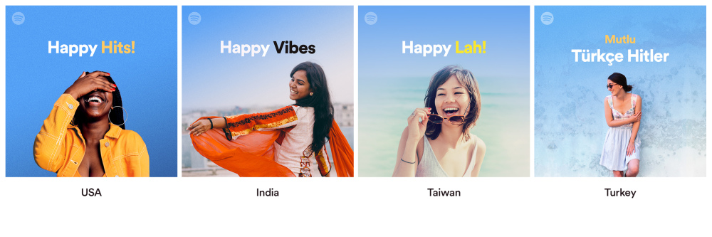
The music and podcast app Spotify provides an excellent example of how this can be done by using a variety of models to present the same basic message in different culturally appropriate ways.
Colours and symbols
Did you know that colours can have different meanings across cultures? For example, Japanese people associate the colour white with mourning, while many Asian countries associate red with good luck. This is why Uber went to considerable length in ensuring that each country has a colour palette of its own, using mood boards and combinations of colours that had positive connotations in the respective country.
The same level of effort must be applied for ensuring that symbols say what you think they do in the target culture – emojis, for example, can have a wide variety of meanings depending on where in the world you are.
Products are local too
It is one thing to localise the ways in which content is presented, or in other words how you offer your product or services. But UX localisation also requires the tailoring of the products and services you offer so that they are as suited to the needs and demands of the local people as possible. In 2017 Ctrip bought Trip.com and invested in localisation to offer unique services relevant to the customer base in the respective target areas.
A plan for going global
A good plan for going global with your software or application includes the localisation of UX design. To succeed in this, it is instrumental to work with experts in the local culture of the market you are targeting, to know the needs of the market you are seeking to serve, and to take a trans-creative approach – working closely with the translator – where both the content and the user interface are re-shaped in a way that localises not just words but the customer’s experience.

